

At Sage x Clare we’re BIG believers in the power colour, texture, lighting and even scent have on our mood and overall wellbeing. This ties into our mission to bring a whole lotta love into homes all over the world and why we’re dedicated to crafting such joy-filled and mood-boosting wares.
We live for colour. Blending it in fresh, unexpected ways is our signature and at the heart of every collection we launch. Layering complementary and contrasting colours and patterns adds warmth, personality and soul to your home—and looks just as good as it feels.
Whether your interior style skews bold and maximalist or is more subtle, everyone has their preferences or opinions on the best colour combinations for different spaces.
And as colour lovers, asking us about the best colour combos is like asking us to choose a favourite child—no easy task! But if you need some fresh inspiration or guidance around which interior decoration colour combinations work best read on.
Understanding the Power of Colour Contrasts in Interior Design
Before we explore some of our favourite colour pairings, let’s take a quick refresher on the basics of colour theory. Our trusty colour wheel, featuring primary, secondary and tertiary colours, can help us better understand the relationship between different colours and what pairings may or may not ‘work’.

On the one hand, complementary colours create maximum contrast and visual interest. How do you identify them? Simple—they sit opposite each other on the colour wheel.
On the other hand, analogous colours sit side by side and make for a more subtle and harmonious look.
Then we have our triadic colours. As the name suggests these shades form a triangle on the colour wheel. You can thoughtfully layer these for a vibrant but balanced vibe.
If you get the tension just right between your contrasting colours, that’s where the visual magic happens. Whether you want to create vibrancy, drama, movement, balance or calm, there is a contrasting colour story to suit the job.
Contrasts can be used to inject soul and style into every corner of your home. Highlight a special architectural detail, create a showstopping focal point or define a zone, the sky’s the limit!
Bold Moves: Creating Impact with High-Contrast Colour Combinations
It will come as no surprise we are slightly (alright…a lot) obsessed with complementary colour schemes. Nothing adds personality, drama, charm and greater visual interest quite like a bold high-contrast colour palette. Here are some stylish combos we come back to time and time again.
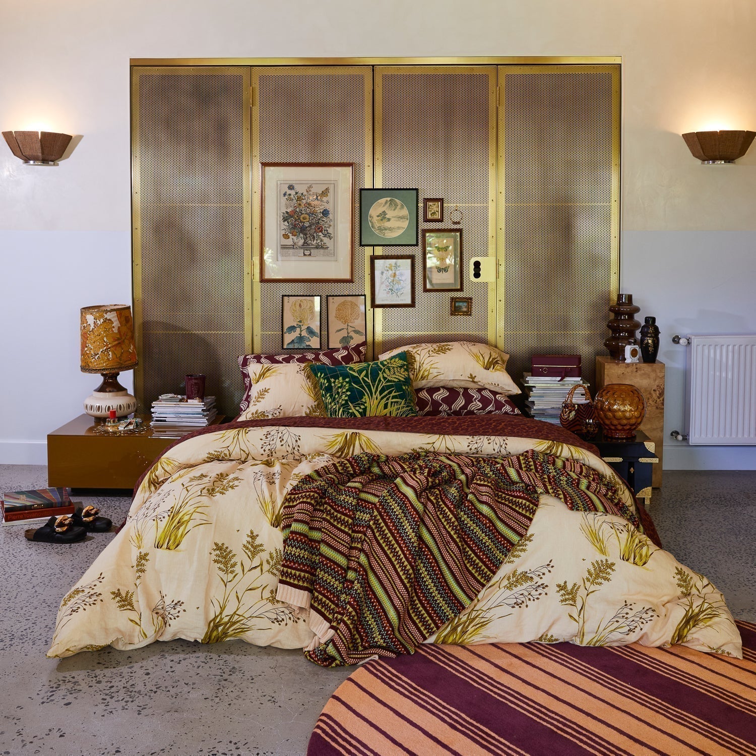
Raspberry x Mustard
This bedroom features a dynamic, high-contrast colour palette anchored in warm jewel tones and bold complementary pairings. The bedding’s vibrant stripes create visual energy through a triadic scheme that’s both playful and luxe. Accent cushions in mustard offer an earthy contrast, grounding the intensity of the bedding and adding retro flair. Deep plum curtains and a multicoloured tufted geometric rug echo and balance the palette, enhancing the room’s layered, expressive mood without overwhelming it.

Scarlet Red x Cerulean Blue
This bedroom is a masterclass in complementary and primary colour contrast, creating a look that’s vibrant yet balanced. The red quilt cover paired with pops of cerulean blue creates a classic red–blue complementary tension. While touches of mustard and burgundy in feature cushions introduce warmth and tactile depth. Striped pillows in varying shades and textures echo the primary palette but soften the contrast nicely. Grounded by the natural wood tones of the cabinetry and retro styling, the overall effect is graphic, playful and richly layered.

Emerald Green x Mahogany
This bedroom features a vibrant and unconventional complementary palette, anchored by a bold emerald green base, contrasted with sunny florals and accessories. This unexpected pairing creates an energetic and fresh look, intensified by mahogany accent cushions that provide earthy warmth and visual grounding. The tufted rug reflects the primary colour palette while reinforcing a playful, layered aesthetic. Overall, the space is a confident expression of colour theory in action—using high-contrast opposites and tonal variations to strike a balance between drama, charm and creative flair.

Burgundy x Teal x Fuchsia
This bedroom showcases a rich, botanical-inspired palette that balances deep, moody tones with vibrant accents. The burgundy base of the quilt cover sets a dramatic foundation, layered with intricate floral motifs in teal, mint and fuchsia, creating a complex, high-contrast harmony. The green pillowcases and sheets introduce a luminous contrast that lifts the palette and draws the eye upward. While the plum velvet curtains echo the base tone and enhance the romantic, cocooning atmosphere. Altogether, the palette exudes a sense of vintage opulence and artistic flair, using both complementary and analogous colour relationships to build depth, drama and nostalgic charm.

The Art of Subtlety: Using Low-Contrast Colour Combinations for Harmony
A maximalist aesthetic doesn’t mean subtle and calming interior decoration colour combinations are off the table. Here are some of our favourite subtle colour palettes that ooze unfussy harmony and sophistication.
Ecru x Golden Ochre x Mahogany
This bedroom embraces a subtle, nature-inspired palette grounded in warm, earthy tones. The quilt cover features soft ecru and delicate botanical illustrations in olive, golden ochre and muted brown, creating a gentle contrast that evokes calm and organic elegance. Deep mahogany-patterned sheets bring quiet depth and warmth, enhancing the grounded, vintage mood. Overall, the space feels nostalgic and textural, using analogous hues and restrained contrast to create a serene, lived-in charm that feels timeless and effortlessly cosy.

Rust x Mahogany x Blue
This bedroom features a rich yet understated palette rooted in moody mahogany and rust tones, creating a warm, cocooning base. The bedding introduces accents of cerulean blue and soft turquoise, offering a subtle but effective complementary contrast that adds vibrancy without overwhelming the space. Patterns in rust and burnt orange build cohesion across cushions and sheets, while the soft mint green wall panels provide a cooling counterpoint that gently balances the warmth. The result is a moody, layered aesthetic that feels grounded and artistically expressive.

Rust x Ivory x Muted Plum
This bedroom features a warm, cohesive analogous colour scheme, built on a palette of ochre, ivory, rust and muted plum—all adjacent on the colour wheel. The quilt cover softly blends ivory and muted plum tones, while the mustard-toned walls and striped rug deepen the warmth, creating a grounded, sun-drenched atmosphere. The repetition of yellow-based hues throughout the space offers visual harmony and calm, while subtle pattern mixing in the cushions and lampshade introduces texture without breaking the tonal flow. This use of analogous colours results in a space that feels inviting, layered and uplifting.

Striking the Right Balance: Tips for Successful Colour Contrasting
Our quick tips to inject colour and contrast into your space:
- Follow the 60-30-10 rule. This is where 60% of your room is your dominant colour (think: feature wall, quilt cover or couch), 30% is your secondary colour adding depth (think: curtains, cushions or sheets) and 10% is your accent colour (think: an unexpected red accessory, an artwork, vase or throw).
- In the bedroom, we suggest matching one or two euro pillows with your quilt cover or flat sheet to easily create a cohesive, styled look. For something bolder, contrast your quilt cover design with your euro design choice; for a more subtle touch, link your euros to the flat sheet palette and let the fold-back detail tie it all together.
- Jump on our Bed Builder and have a play with different contrasting colours, patterns and textures from our bedding collection. Try out complementary pairings, bold contrasts or soft layers, and figure out your dream colour combo to suit your project.
- Sample and experiment. Colour combos will behave differently in spaces depending on the light and room size. For this reason, we always suggest playing with fabric swatches and paint samples before you commit to a colour palette overhaul at home. The beauty of soft furnishings—like bedding, cushions and throws—is that they allow you to easily refresh a space, take new colours for a test drive and switch things up seasonally without picking up a paintbrush.
Want more styling tips? Take a look at our journal: How to layer bed linen like a stylist.
At the end of the day, trust your instincts, mix what you love and remember: the most exciting spaces are the ones that feel authentically you—bold or subtle contrasts and all.
Embrace the Spectrum and Transform Your Space
Whether you’re drawn to daring colour clashes or gentle tonal shifts, the magic lies in how you layer, play and personalise your spaces. With the right mix of confidence and colour, your home can tell a feel-good colour story that’s uniquely, beautifully yours.
Ready to create your own colour moment? Explore our bedding, lounge and bathroom collections to thoughtfully layer and style your dream setup.